MENUS:
What is Header and Footer
In any website, the header and footer are global layout sections that appear on almost every page.
The Header is the top section of the website. It usually contains the logo, navigation menu, search bar, login/signup buttons, and important links. It helps users navigate across different sections of the platform.
The Footer is the bottom section of the website. It generally contains secondary navigation links such as About Us, Contact, FAQs, Terms & Conditions, Privacy Policy, social media links, and other informational content. It also improves SEO by providing structured internal linking.
How Header and Footer Work Dynamically in ENACTCASHBACK - LITE
Enact Cashback - Lite uses a dynamic menu system connected to the database. Instead of hardcoding navigation links inside Blade files, menus are stored in the database and rendered dynamically on the frontend.
This means:
You can create, edit, reorder, or remove menu items from the admin panel.
No code changes are required.
Changes reflect instantly on the frontend after saving,
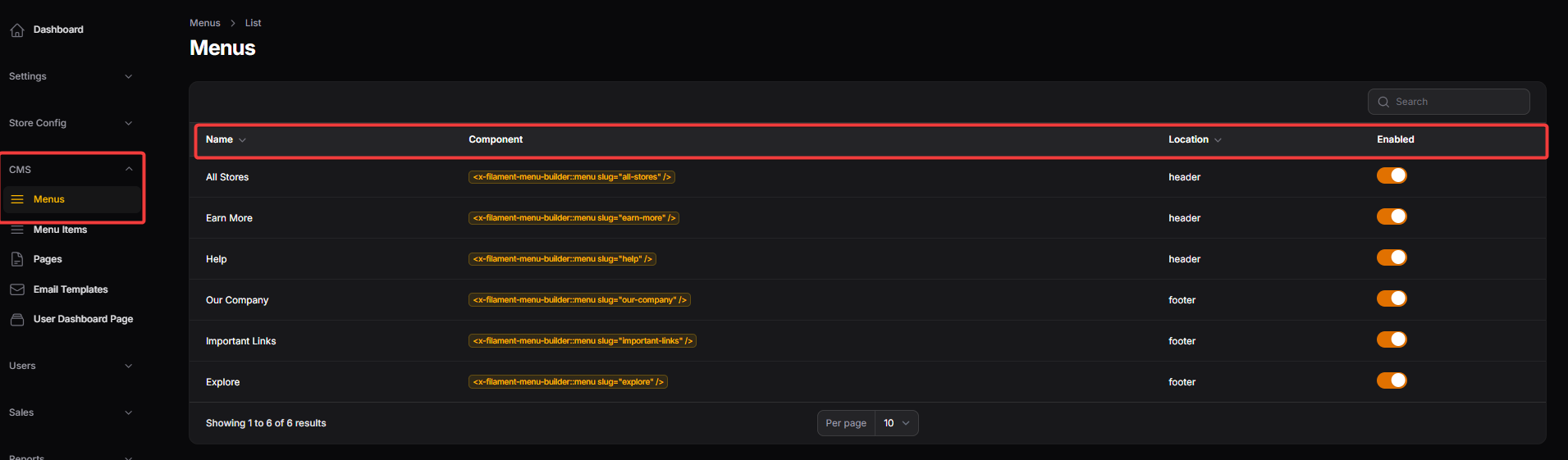
Name: Displays the internal label for the navigation menu, such as "All Stores" or "Help," allowing administrators to easily identify which link set they are managing.
Component: Shows the technical slug or code snippet used by the system to render that specific menu structure within the frontend templates.
Location: Indicates where the menu is physically positioned on the website, typically categorized as either the header (top navigation) or the footer (bottom links).
Enabled: A toggle switch that allows administrators to instantly activate or deactivate a menu, controlling its visibility on the live website without deleting the configuration.
MENU ITEMS
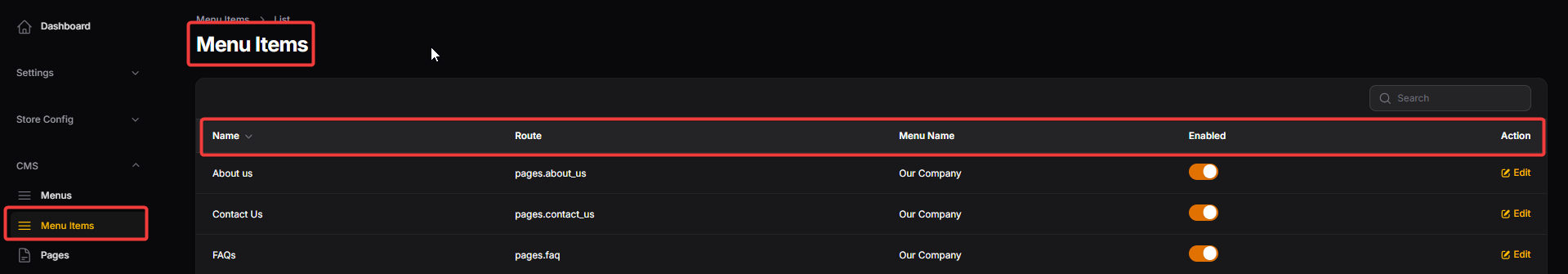
Name: The display text for the individual link as it appears to the user, such as "About us," "Contact Us," or "Refer & Earn."
Route: The technical path or internal page identifier that tells the system exactly which page to load when a user clicks the menu item.
Menu Name: Identifies the parent group or category (e.g., "Our Company," "Important Links") that this specific item belongs to.
Enabled: A toggle switch that allows administrators to instantly turn the visibility of a specific link on or off across the frontend.
Action: A functional button (e.g., Edit) used by administrators to modify the details or settings of an existing menu item record.
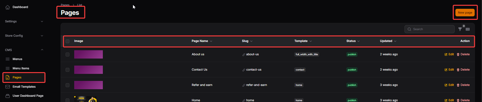
PAGES
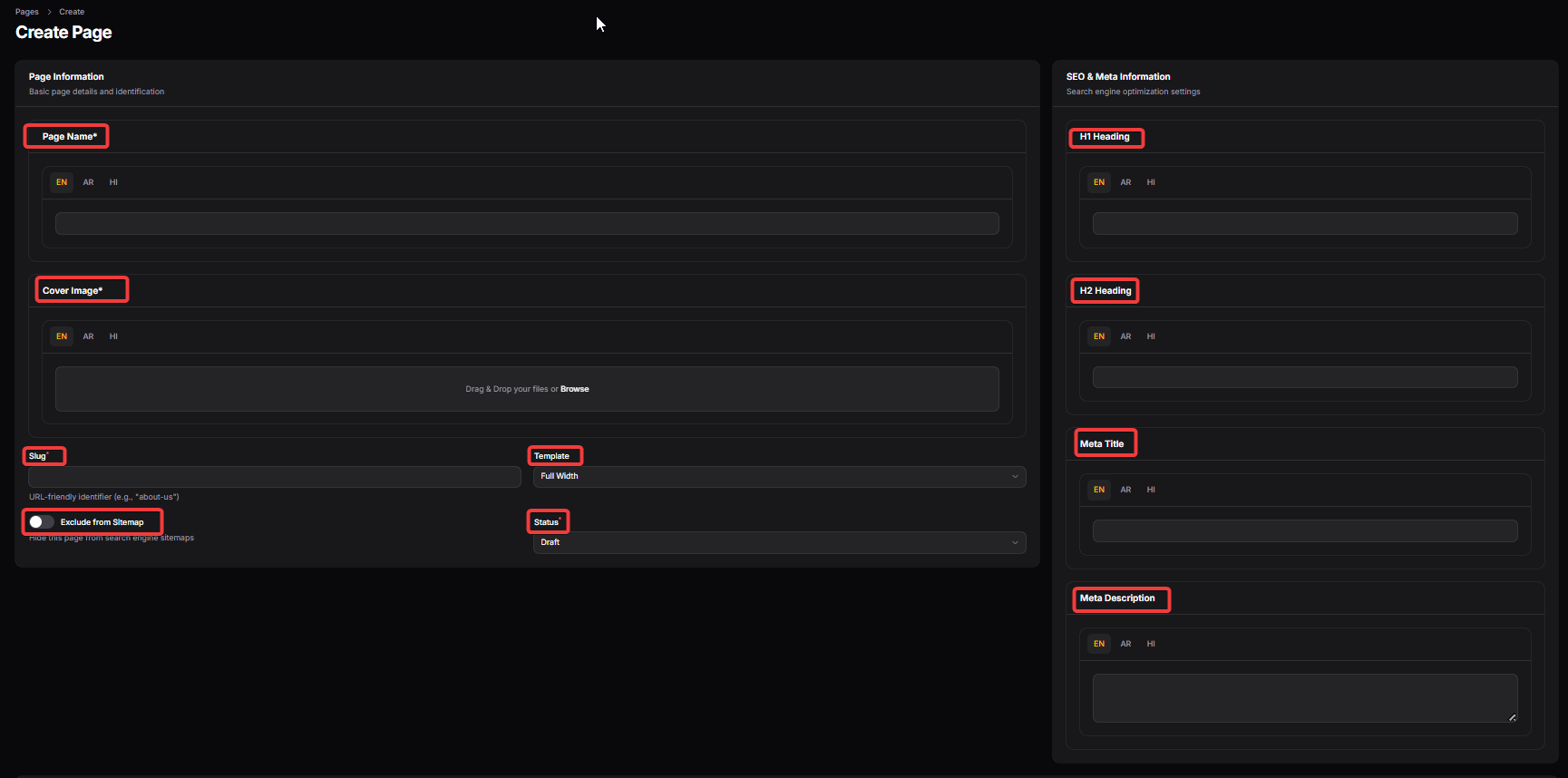
Page Information (General Details)
Page Name: The official title of the page used for internal identification and as the primary heading for users (supports multi-language input: EN, AR, HI).
Cover Image: A visual asset area where administrators upload a banner or featured image to be displayed at the top of the specific page.
Slug: A URL-friendly identifier (e.g., "about-us") that determines the direct web address for that specific page.
Exclude from Sitemap: A toggle switch that, when enabled, hides the page from search engine sitemaps to prevent it from being indexed.
Template: A dropdown selection to choose the layout style for the page, such as "Full Width," to control how content is structured.
Status: Indicates the current state of the page, allowing administrators to keep it as a Draft or set it to Published for live viewing.
SEO & Meta Information
H1 Heading: The primary HTML heading for the page, used by search engines to understand the main topic of the content.
H2 Heading: A secondary heading used to organize content sub-sections, aiding both user readability and SEO ranking.
Meta Title: The specific title that appears in browser tabs and search engine results, optimized to attract clicks.
Meta Description: A brief summary of the page content that appears under the title in search results to provide a preview to users.
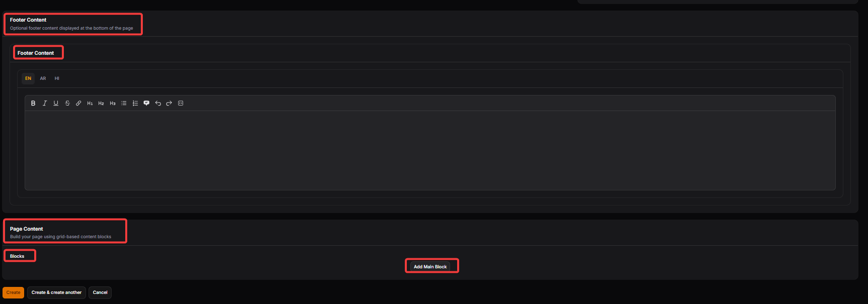
Footer Content Section
Footer Content (Header/Label): This section allows administrators to add optional, static information that will be specifically displayed at the very bottom of the individual page being created.
Footer Content (Text Editor): A multi-language rich text editor (supporting EN, AR, HI) used to format and input secondary page information, legal disclaimers, or additional contact details.
Page Content Section
Page Content (Label): The primary module used to build the main body of the page using a flexible, grid-based system for structured information delivery.
Blocks: This represents individual layout units that can be customized with text, images, or other media to create a dynamic page structure.
Add Main Block: A functional button that allows the administrator to insert a new content section into the page, enabling the creation of complex layouts one block at a time.
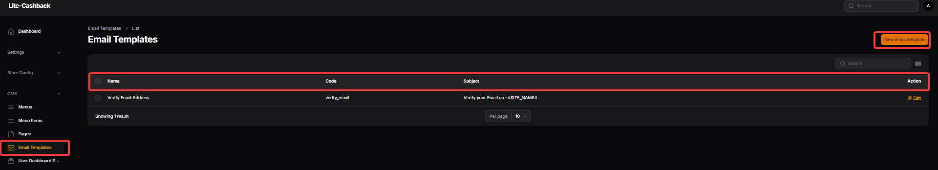
EMAIL TEMPLATES
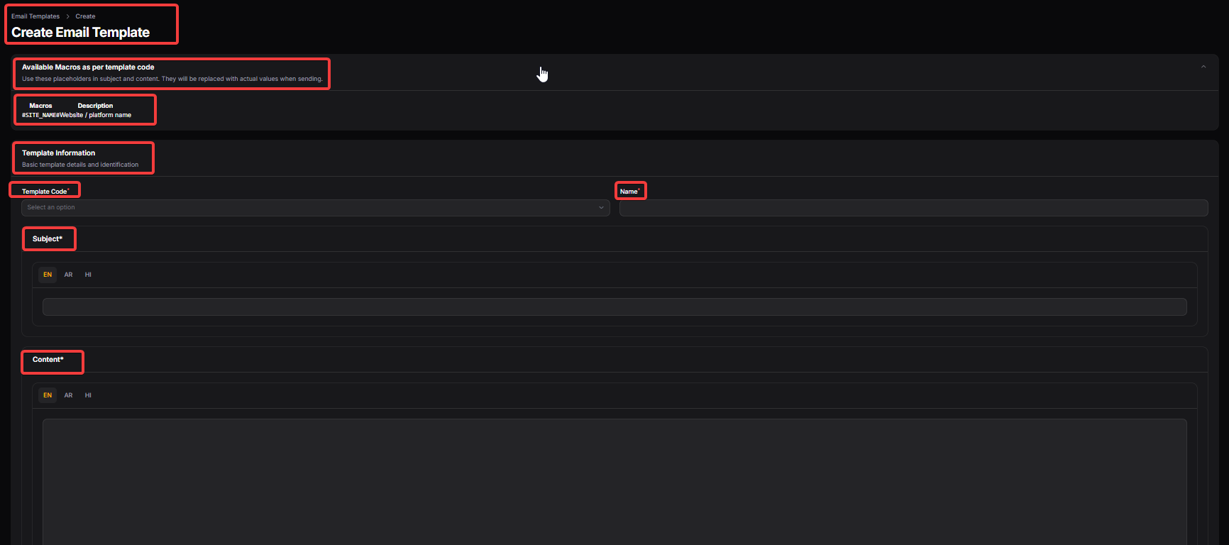
Available Macros
Available Macros as per template code: This section lists dynamic placeholders that can be inserted into the email's subject or body. They are automatically replaced with real data (like a user's name or site title) when the email is sent.
Macros / Description: A reference table that shows the specific code (e.g.,
#SITE_NAME#) and explains what data it represents, ensuring administrators use the correct variables for personalization.
Template Information
Template Information (Label): The primary module for defining the basic identity and functional details of a new system email.
Template Code: A dropdown selection used to link the design to a specific system event, such as a "Welcome Email" or "Payout Confirmation."
Name: The internal title given to the template to help administrators identify and manage it within the backend list.
Email Content Details
Subject: A multi-language field (EN, AR, HI) where administrators write the email's subject line. Macros can be used here to make the subject dynamic for each recipient.
Content: The main body of the email, provided as a multi-language rich text area. This is where the primary message is composed and formatted using various macros to provide transaction-specific information.
USER DASHBOARD PAGES
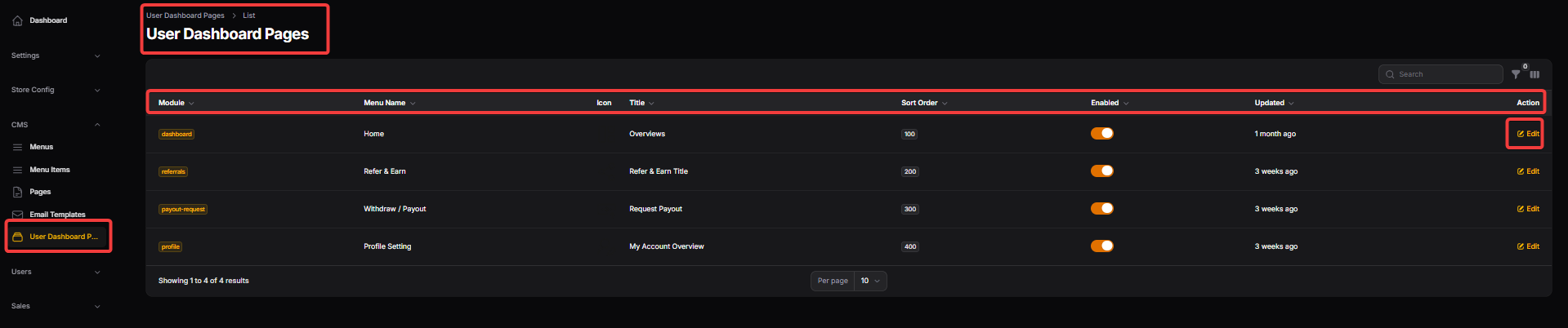
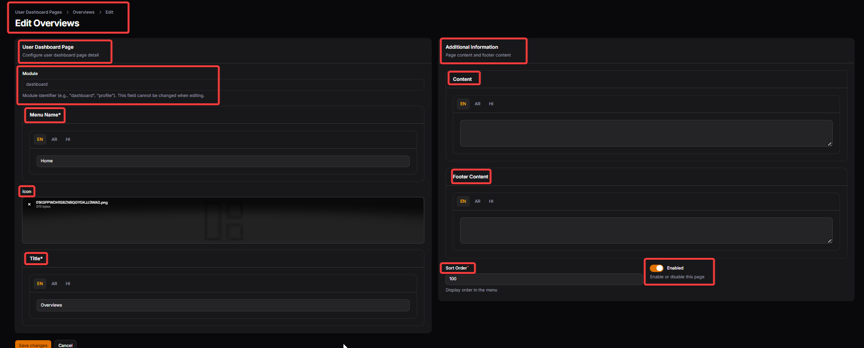
User Dashboard Page Configuration
Module: A unique system identifier (e.g., "dashboard") that links the settings to a specific functional area of the user interface. This field is fixed and cannot be changed once the page is created.
Menu Name: The multi-language label used to identify this page within the sidebar or navigation of the user’s account area.
Icon: An upload field for the specific graphic or symbol that appears next to the menu name to help users visually identify the section.
Title: The primary heading displayed at the top of the actual dashboard page (supports EN, AR, and HI for localized user experiences).
Additional Information & Visibility
Content: A rich text area used to input the main descriptive information or instructions that the user will see when viewing this specific dashboard section.
Footer Content: An optional text area for secondary information, such as legal disclaimers or help links, displayed at the bottom of the dashboard page.
Sort Order: A numerical value that determines the sequence in which this page appears in the user’s menu; a lower number typically moves the item higher in the list.
Enabled: A toggle switch that allows administrators to instantly activate or deactivate the specific dashboard page for all users.